Clients:
Melkweg Expo
HKU
TFB Magazine
Keti Koti Utrecht
Metropole Orkest
Queer in Wonderland
Melkweg Expo
HKU
TFB Magazine
Keti Koti Utrecht
Metropole Orkest
Queer in Wonderland
Privacy & AVG
© All rights reserved to Thomas Bunt
© All rights reserved to Thomas Bunt
001
GRAPHIC DESIGN
TYPOGRAPHY
CONCEPT
LOGO
VISUAL IDENTITY
TYPOGRAPHY
CONCEPT
LOGO
VISUAL IDENTITY
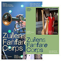
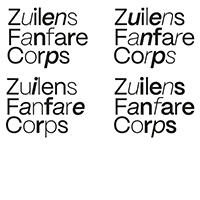
IMAGE 1-4:
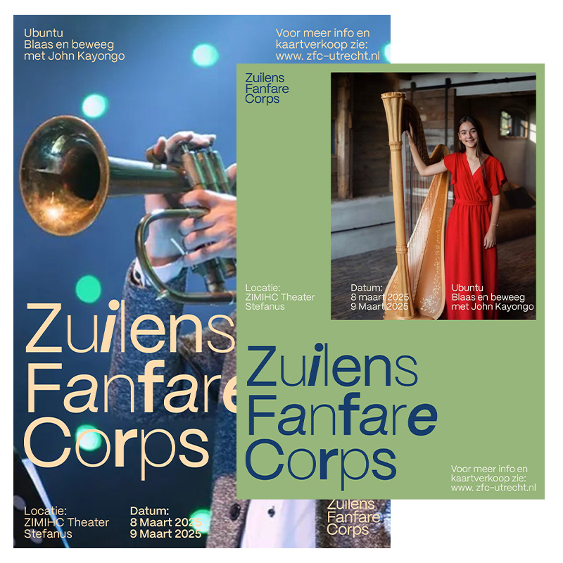
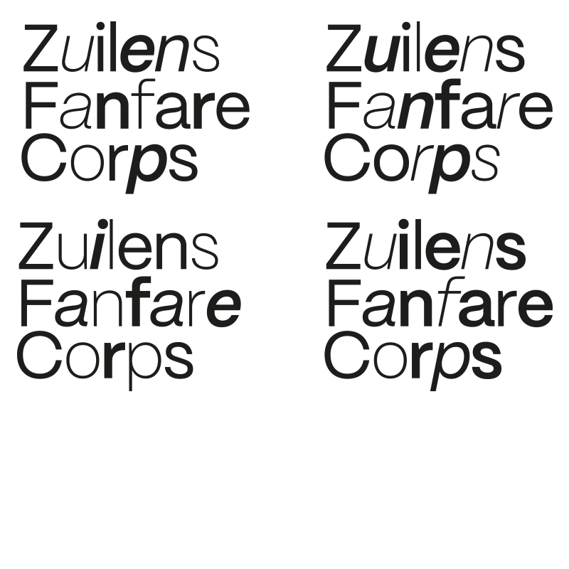
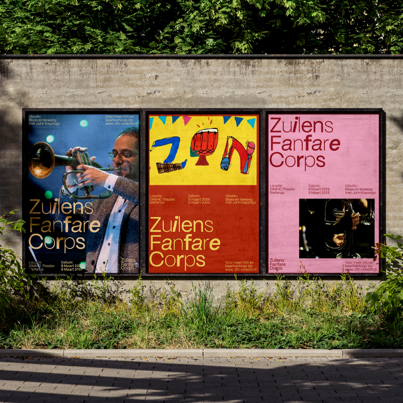
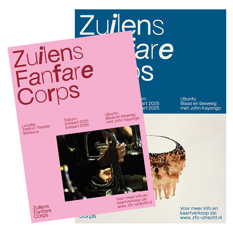
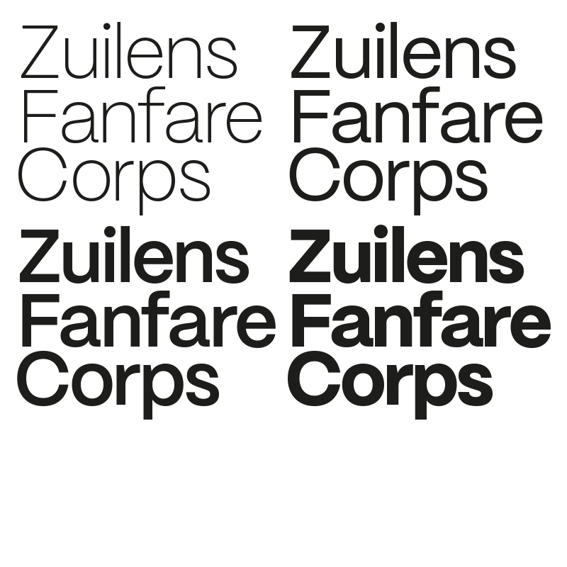
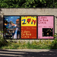
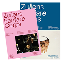
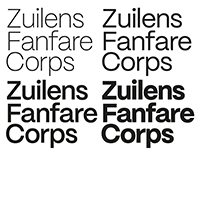
ZUILENS
FANFARE
CORPS
ZUILENS
FANFARE
CORPS
Commissioned
by ZFC
by ZFC
A new visual identity for Zuilens Fanfare Corps highlighting the difference of every instrument creating a harmonial and symphonic sound (proposal)
002
GRAPHIC DESIGN
TYPOGRAPHY
CONCEPT
FOUNDER/ OWNER
TYPOGRAPHY
CONCEPT
FOUNDER/ OWNER
IMAGE 1-4:
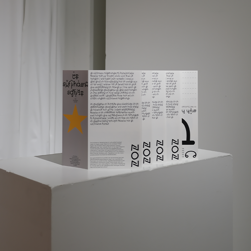
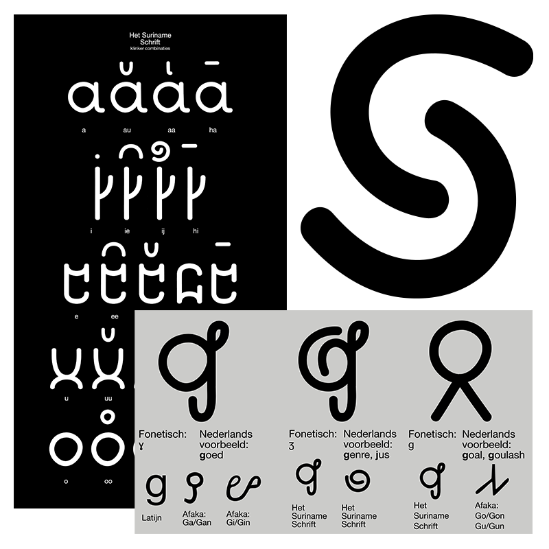
HET
SURINAME
SCHRIFT
HET
SURINAME
SCHRIFT
Supported
by Stimuleringsfonds
by Stimuleringsfonds
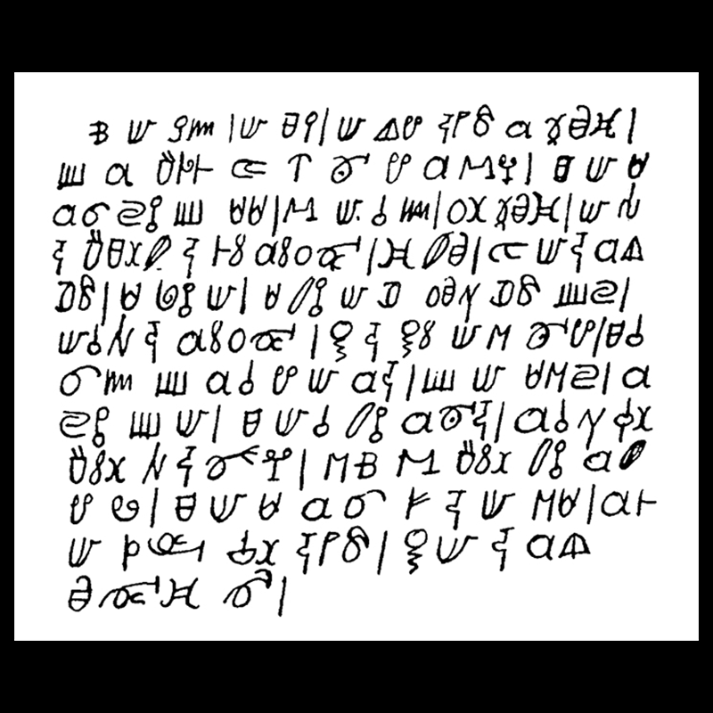
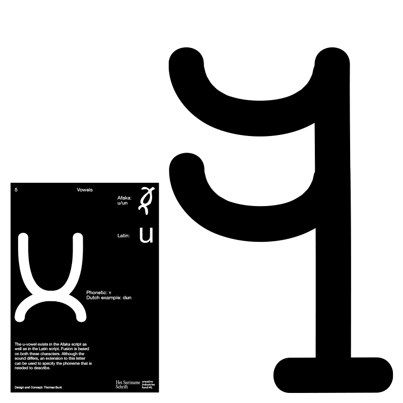
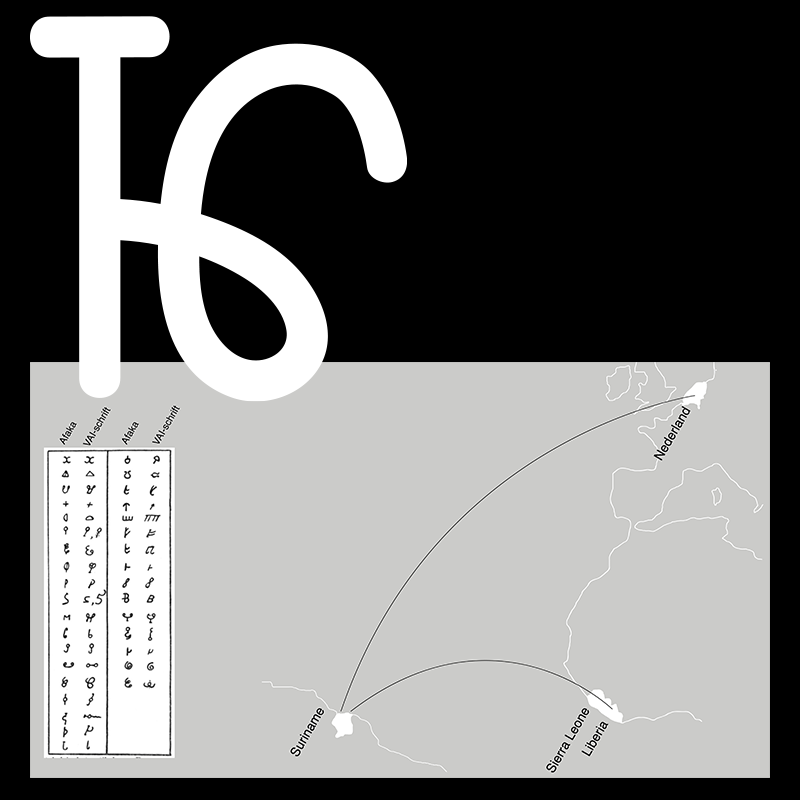
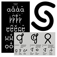
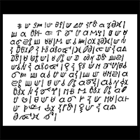
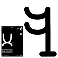
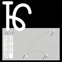
Het Suriname Schrift is a project founded in the beginning of 2024. Containing typographic research in the Surinamese: Afaka-script. With this project a new writing script was created, finding its origins in the Afaka-script and Latin. A hybrid script that depicts a character per phoneme or sound. Focusing on specific languages such as: Dutch, Sranan and Okanisi. Symbolizing a common bi-culturality and the century old intertwined, difficult relationship between the Surinamese and Dutch. Presentation at OSCAM will soon be online.
003
GRAPHIC DESIGN
TYPOGRAPHY
CONCEPT
ART DIRECTION
TYPOGRAPHY
CONCEPT
ART DIRECTION
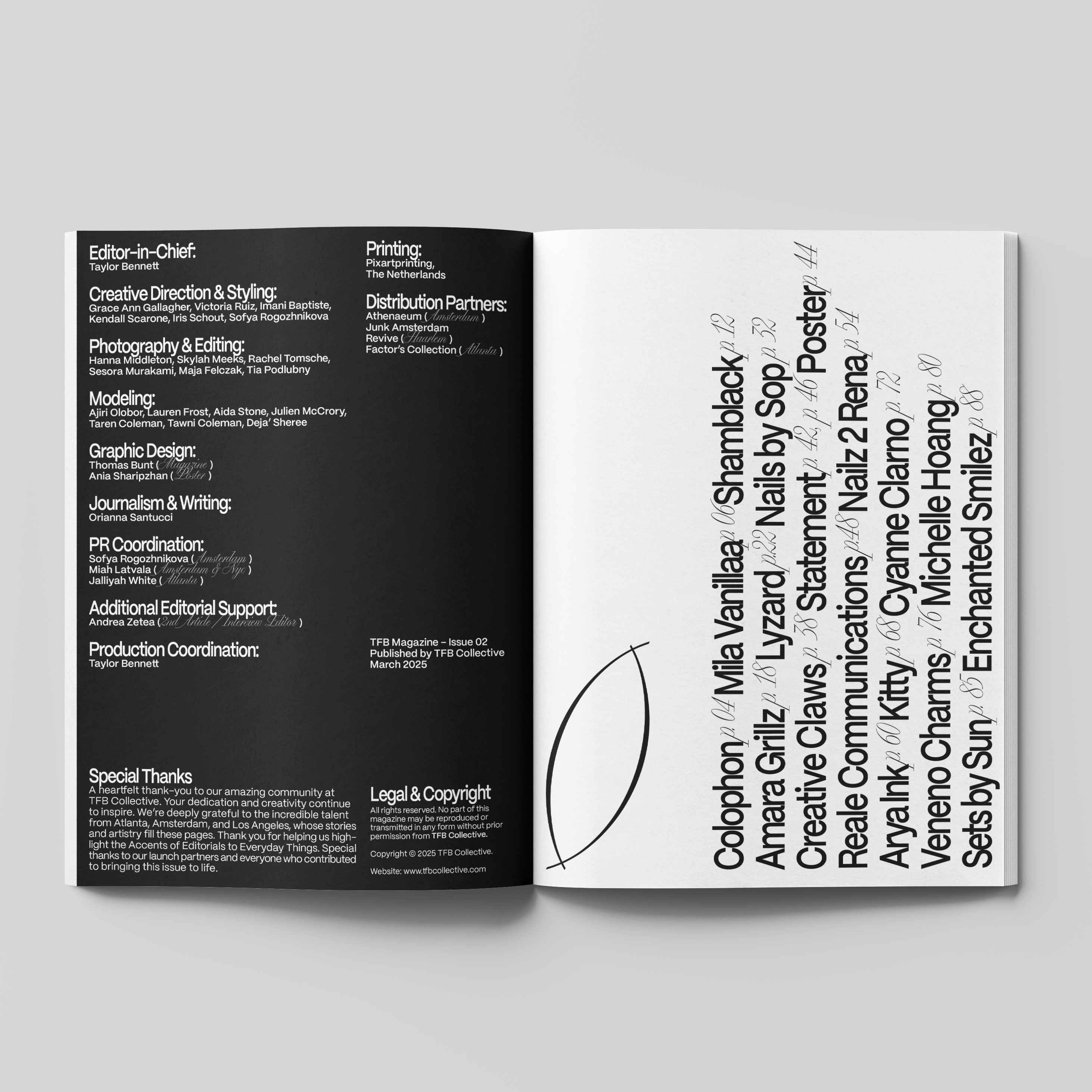
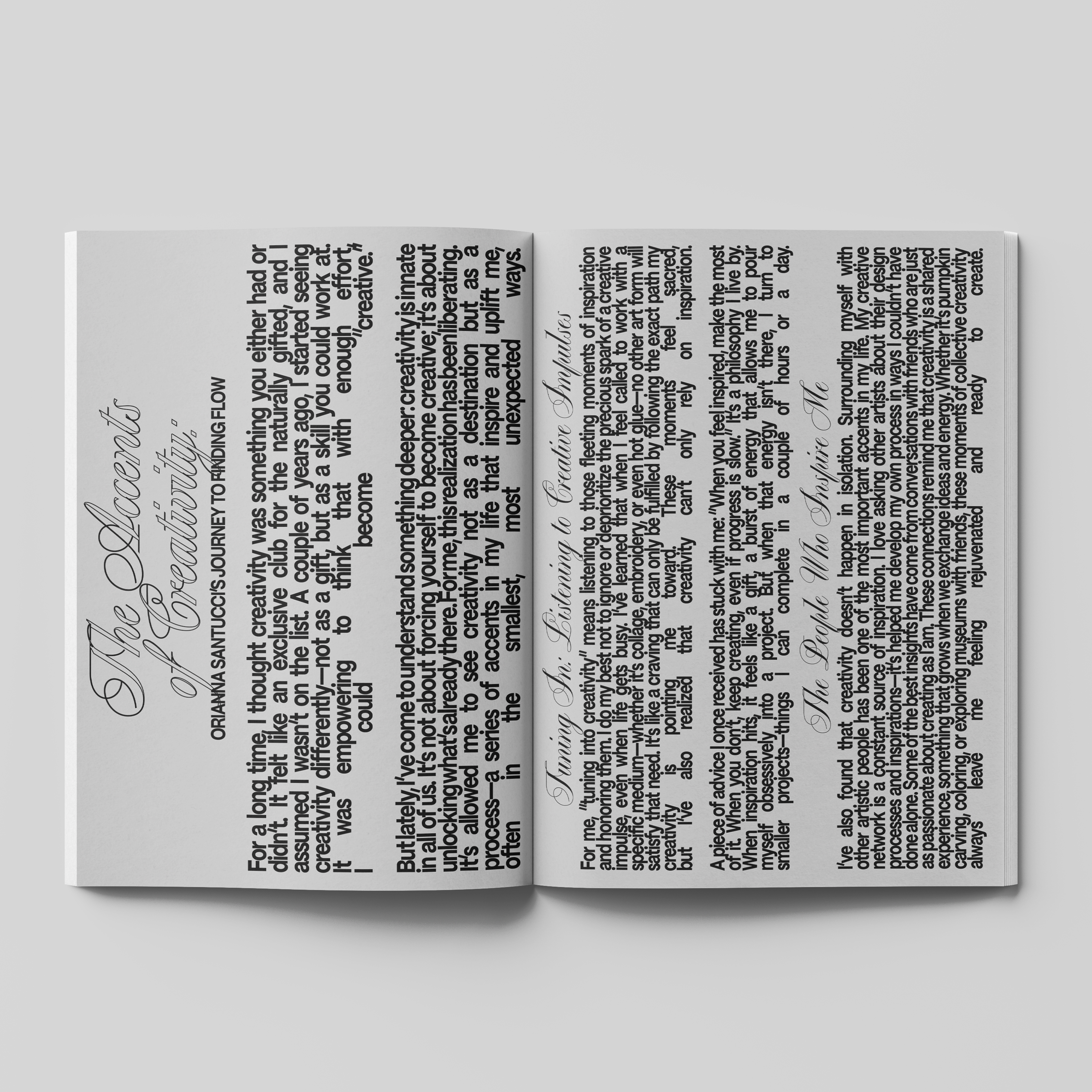
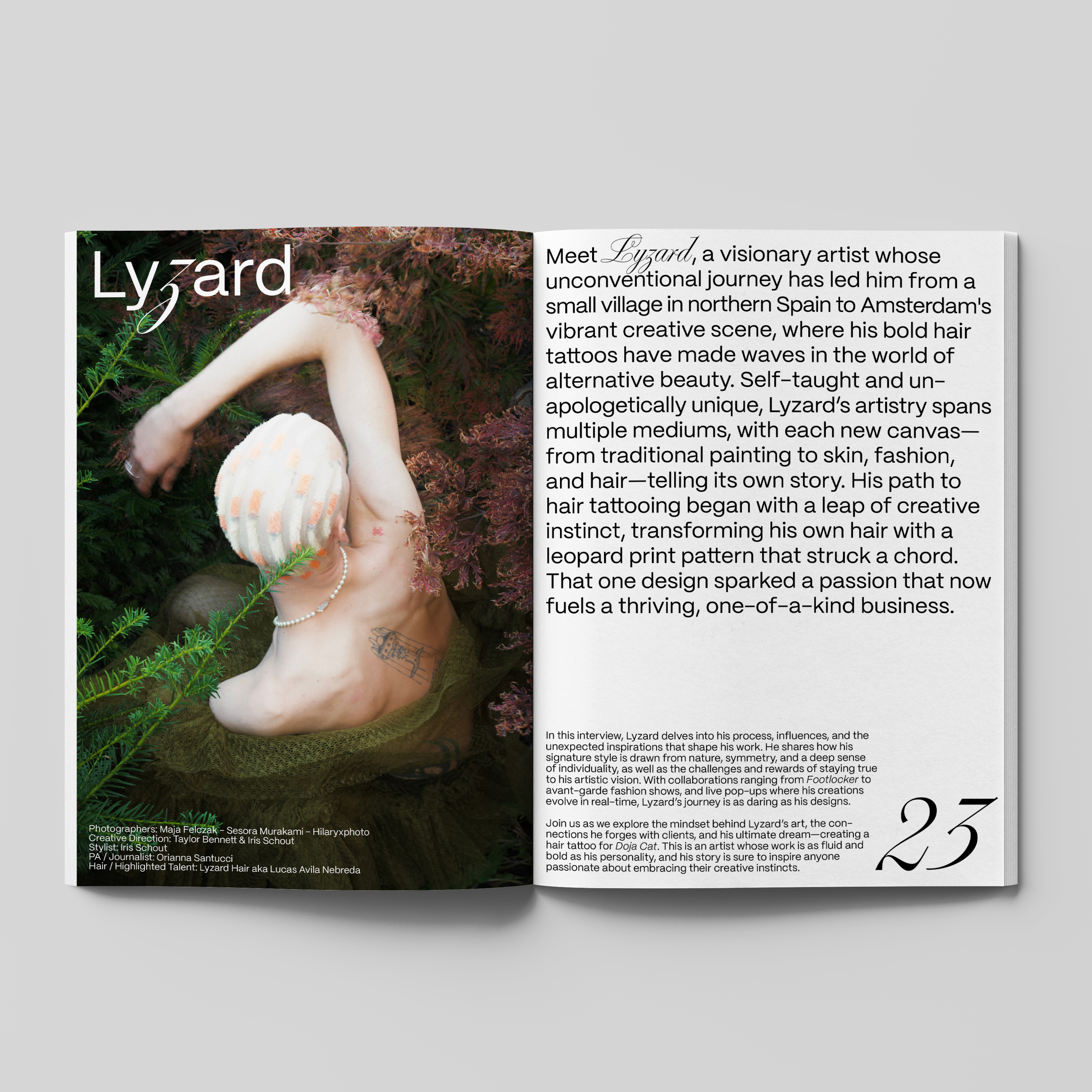
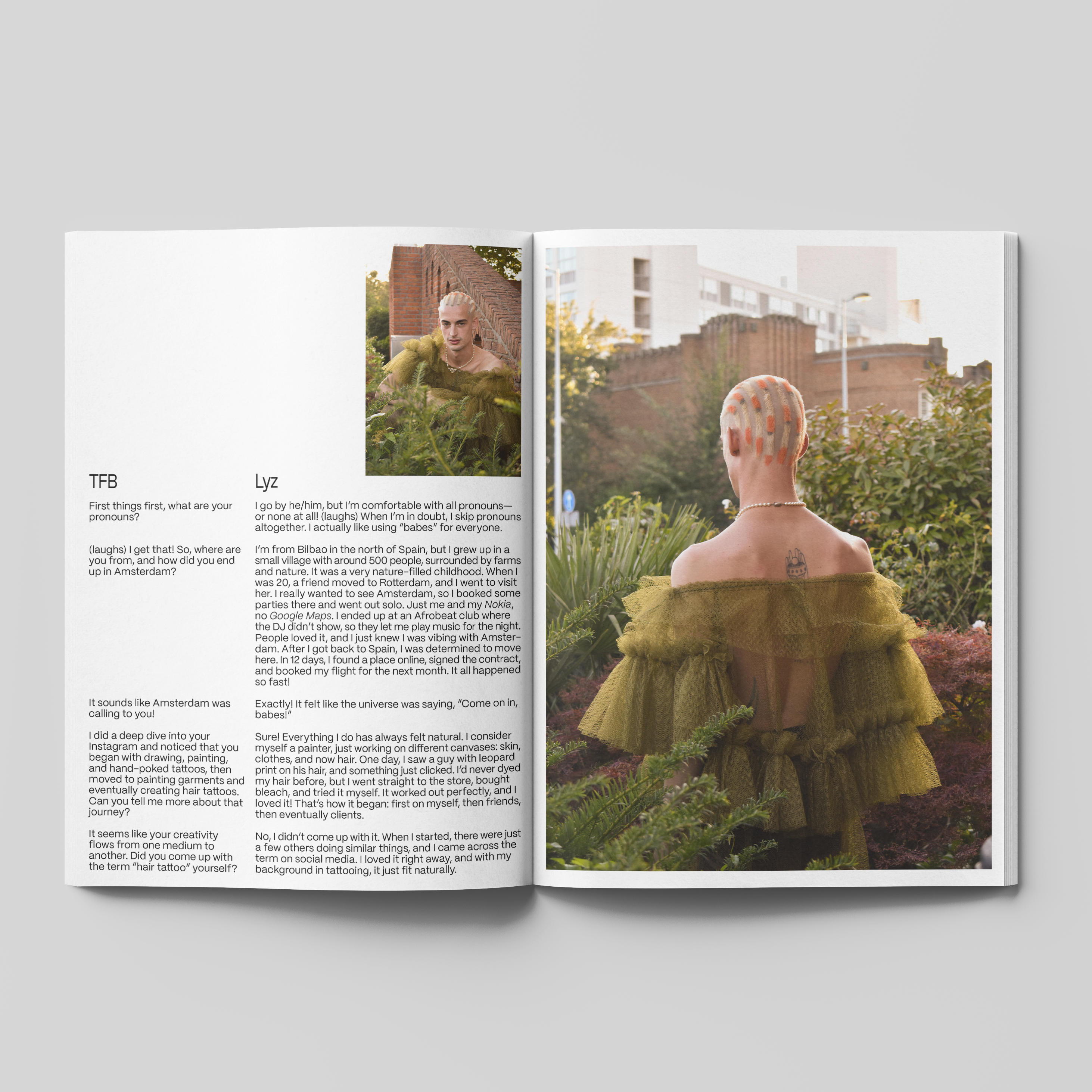
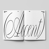
IMAGE 1-9:
TFB
Magazine
TFB
Magazine
Commissioned
by TFB Magazine
by TFB Magazine
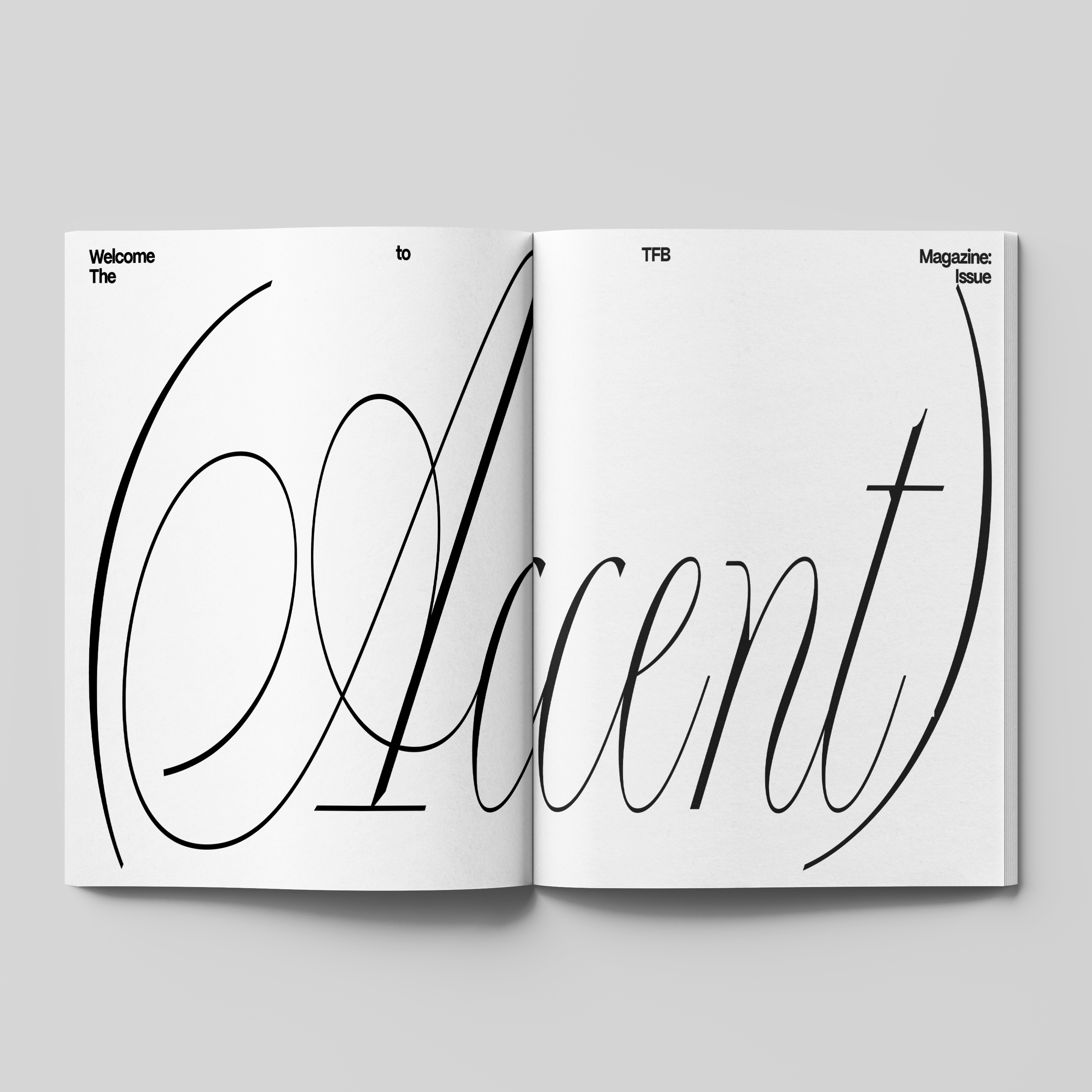
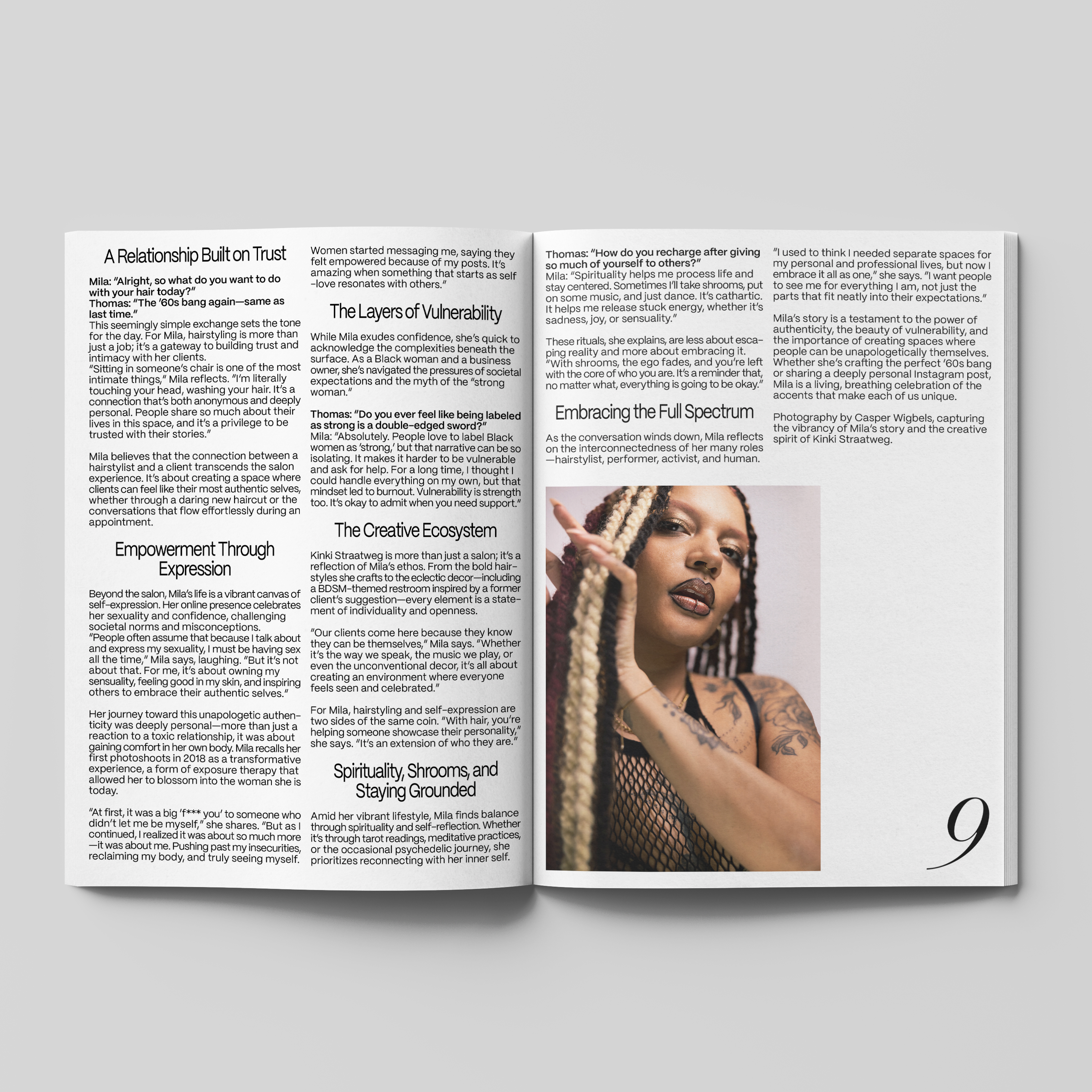
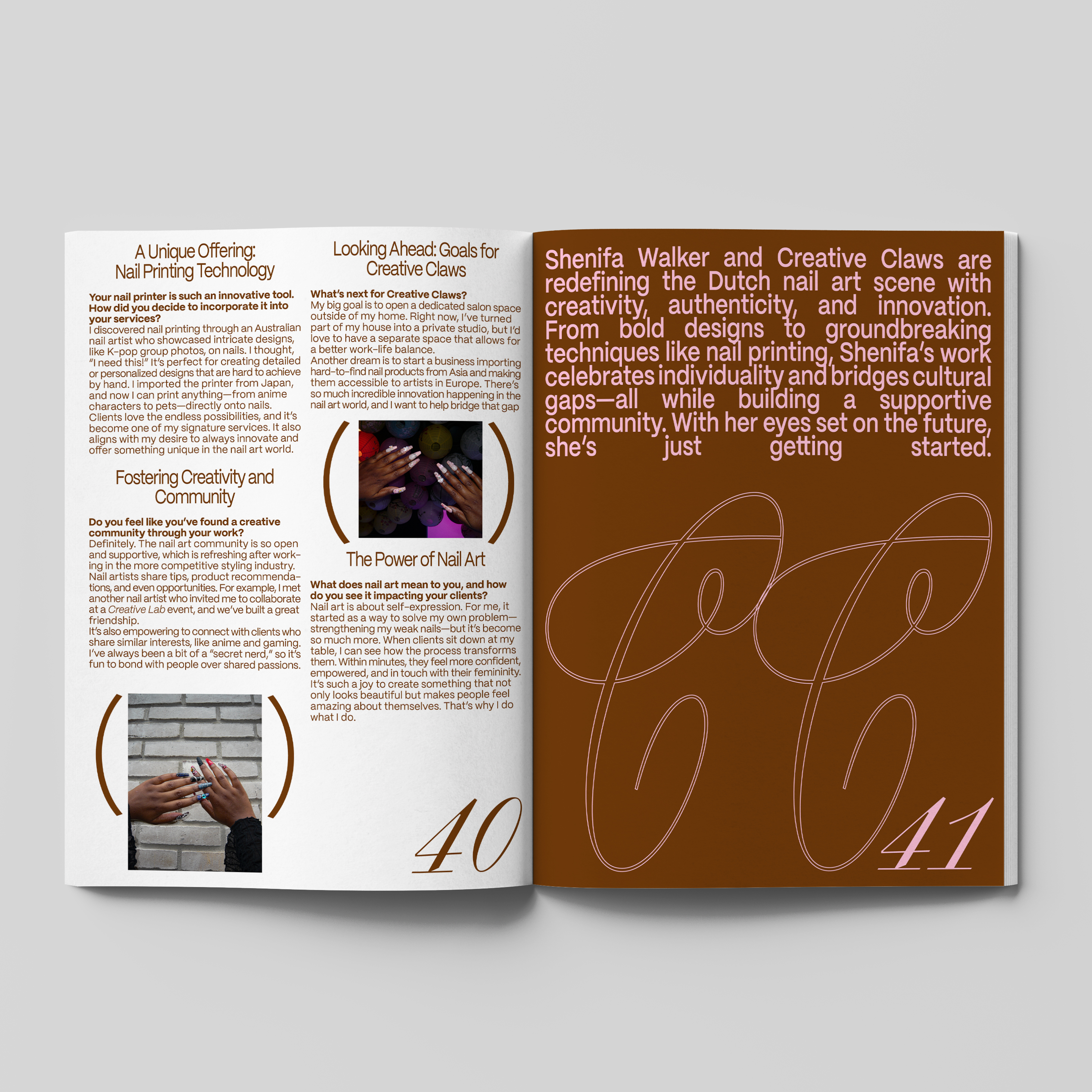
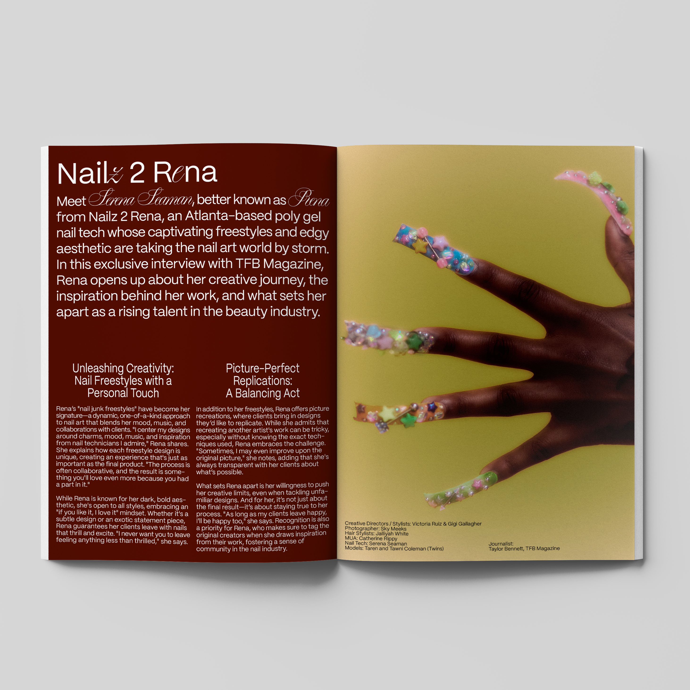
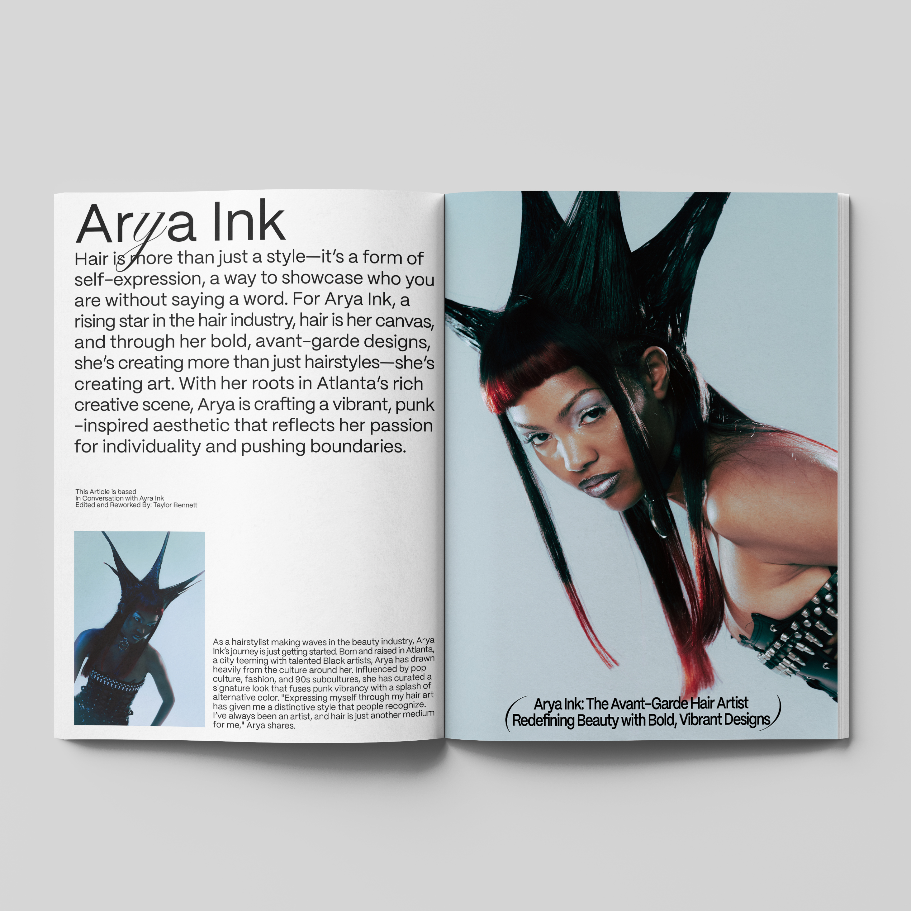
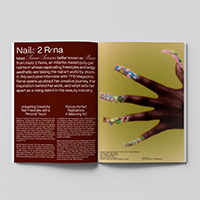
Graphic Design for TFB Magazine's: "The Accent Issue". Highlighting accents like grills, hair and nails in every way shape or form. For this concept we hightlighted the accents of pages, for example: page-numbers or credits. Brackets are usually a way to nuance a sentence or share 'less' important information. For this issue we put the bracket () on a pedestal and used this character as design element throughout the issue.
004
GRAPHIC DESIGN
TYPOGRAPHY
CONCEPT
ART DIRECTION
TYPOGRAPHY
CONCEPT
ART DIRECTION
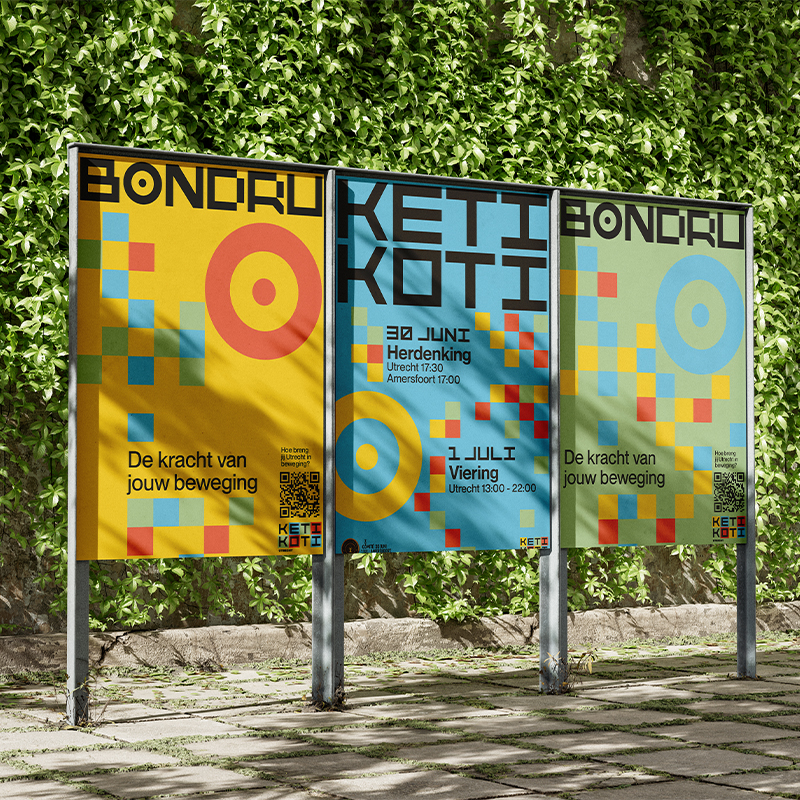
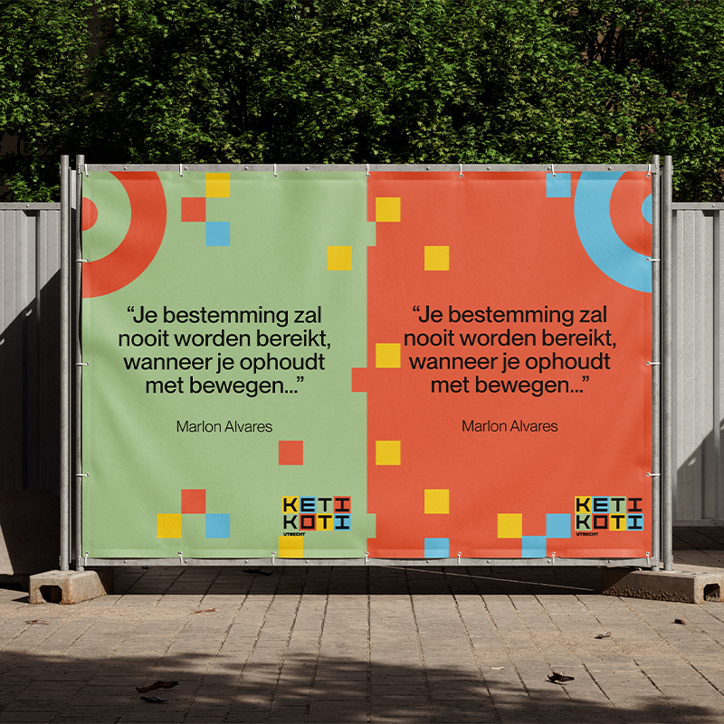
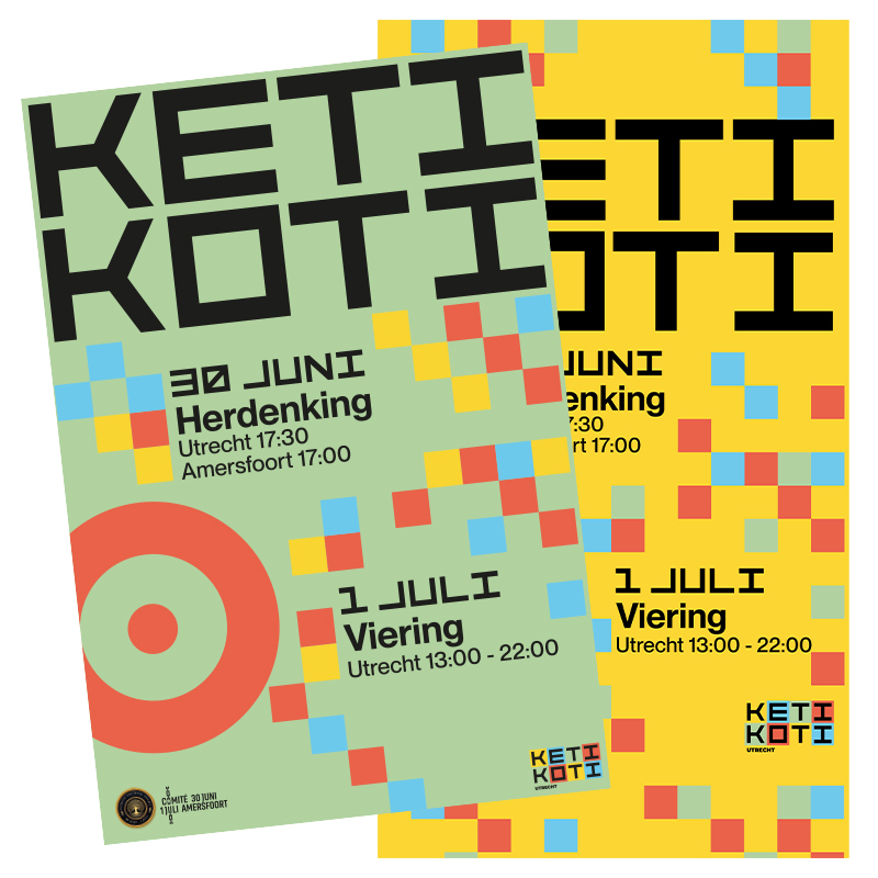
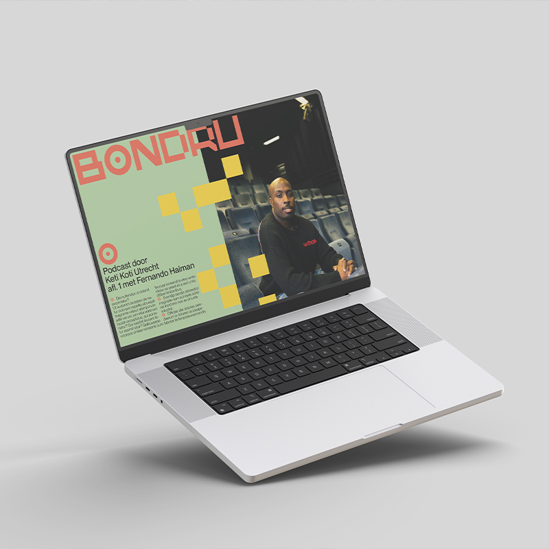
IMAGE 1-5:
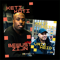
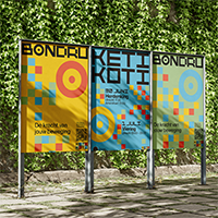
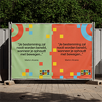
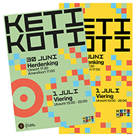
Keti Koti
Utrecht
Keti Koti
Utrecht
Commissioned
by Keti Koti Utrecht
by Keti Koti Utrecht
The 2024 and 2025 campaign for the promotion of Keti Koti Utrecht. Inspired by the pangi madras pattern widely known for its connection to Surinamese culture. This pattern was used fiercely in several headwraps which in turn is a way of communication. This pattern was translated in the graphic design by using the squares as a design element.
005
GRAPHIC DESIGN
TYPOGRAPHY
ILLUSTRATION
CONCEPT
TYPOGRAPHY
ILLUSTRATION
CONCEPT
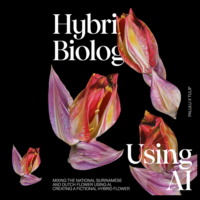
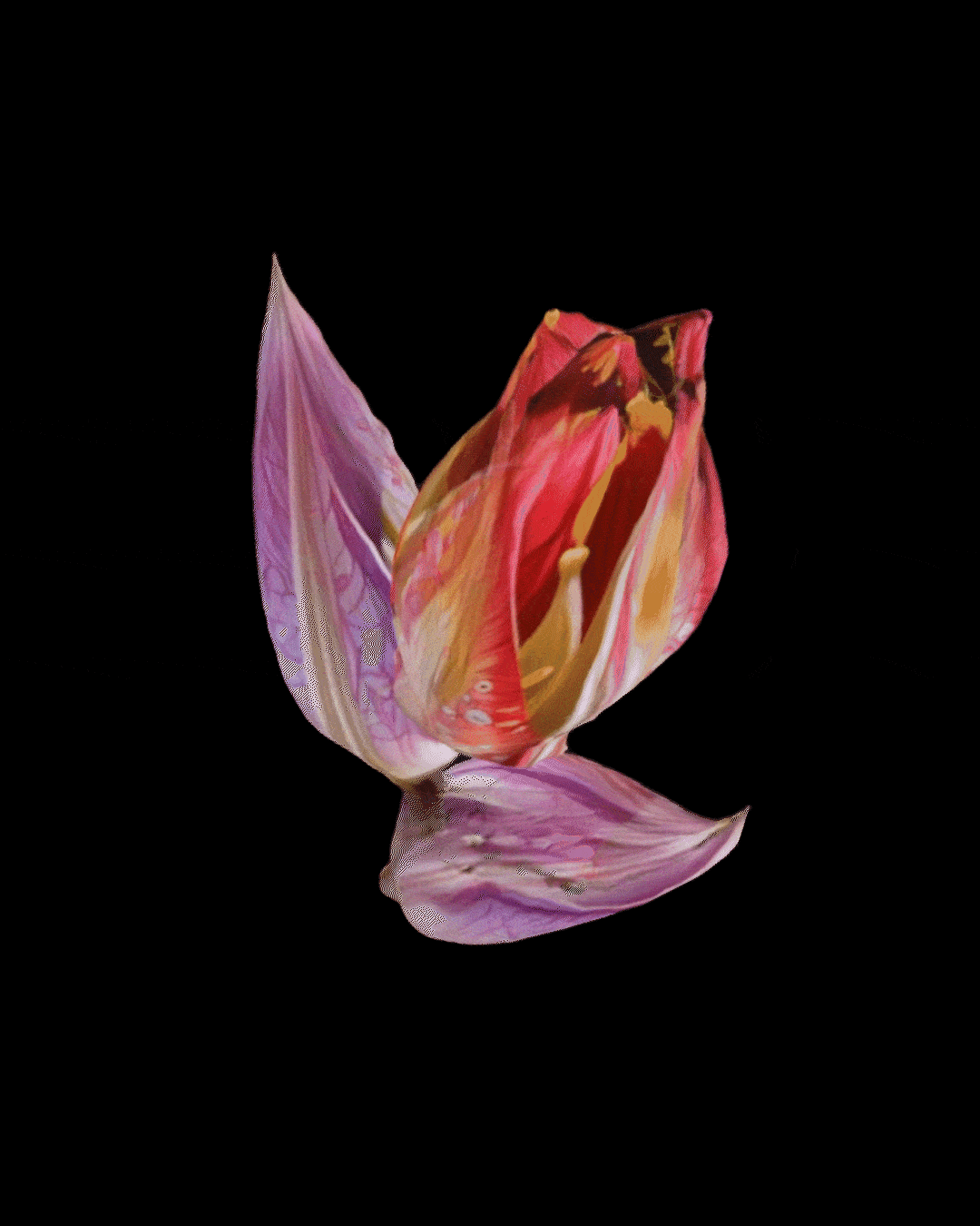
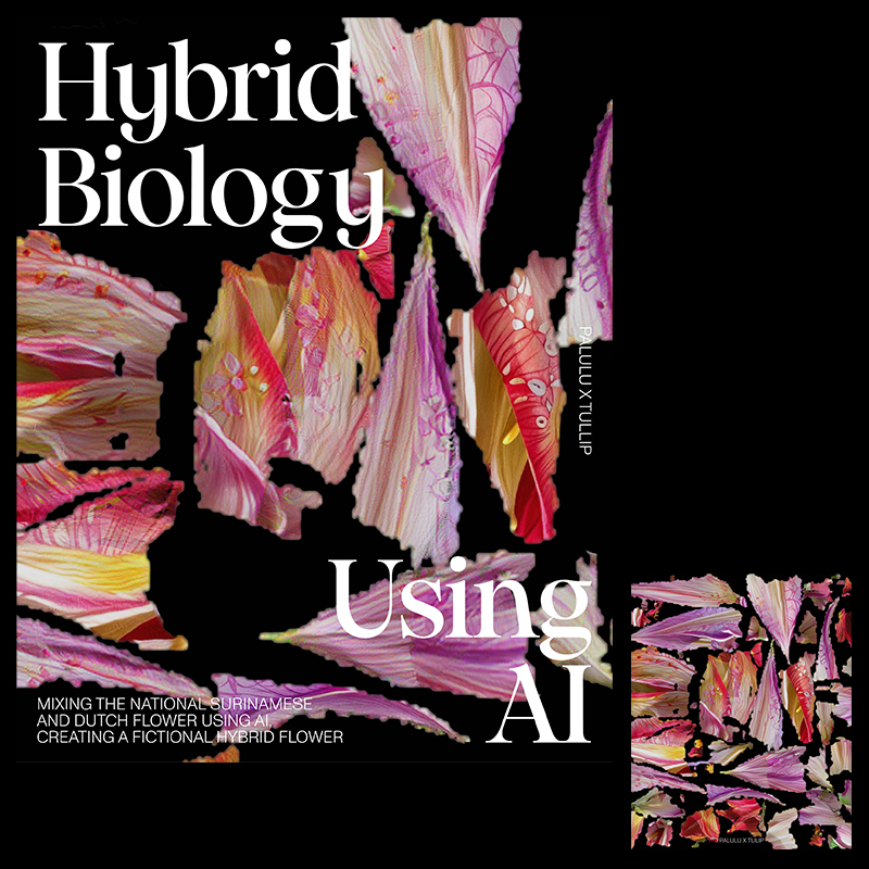
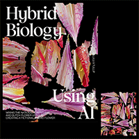
MAGE 1-4:
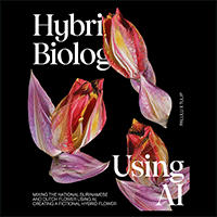
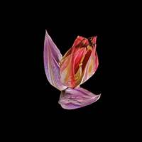
A.I. Gardening
A.I. Gardening
Self initiated
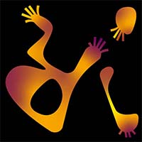
Did some A.I. gardening, combining the tulip with the palulu flower. The result is a fictional hybrid flower. An experiment resulting in a possible symbolization of Surinamese and Dutch bi-culturality.

006
GRAPHIC DESIGN
TYPOGRAPHY
ILLUSTRATION
VISUAL IDENTITY
TYPOGRAPHY
ILLUSTRATION
VISUAL IDENTITY
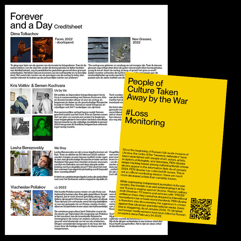
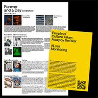
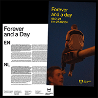
MAGE 1-5:
VISUAL IDENTITY
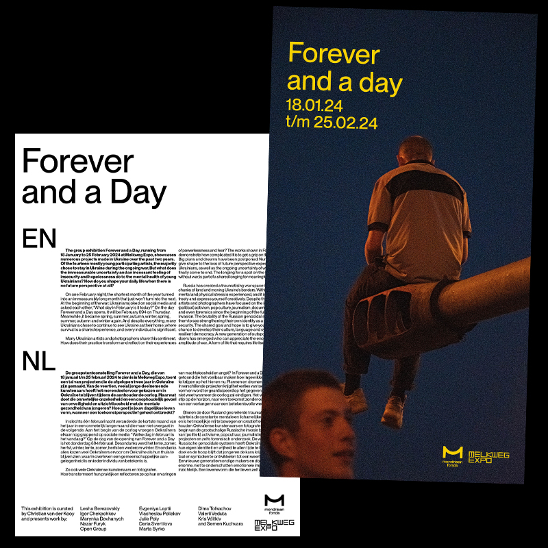
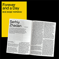
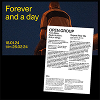
Forever and a day
VISUAL IDENTITY
Forever and a day
Comissioned by
Melkweg Expo
Melkweg Expo
Forever and a Day is an exhibition shining light on young Ukrainian photographers and artists. The graphic design reflects somber times in a place coloured by wartimes.
007
GRAPHIC DESIGN
TYPOGRAPHY
ILLUSTRATION
VISUAL IDENTITY
TYPOGRAPHY
ILLUSTRATION
VISUAL IDENTITY
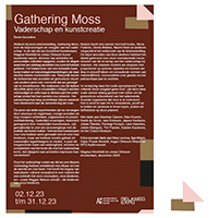
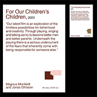
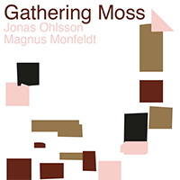
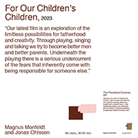
IMAGE 1-6:
VISUAL IDENTITY
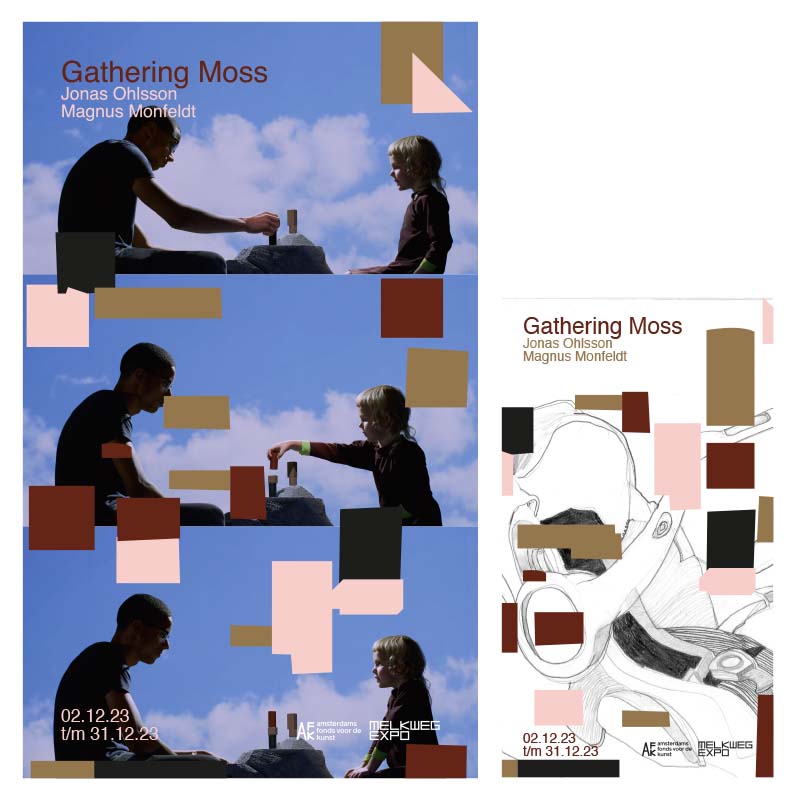
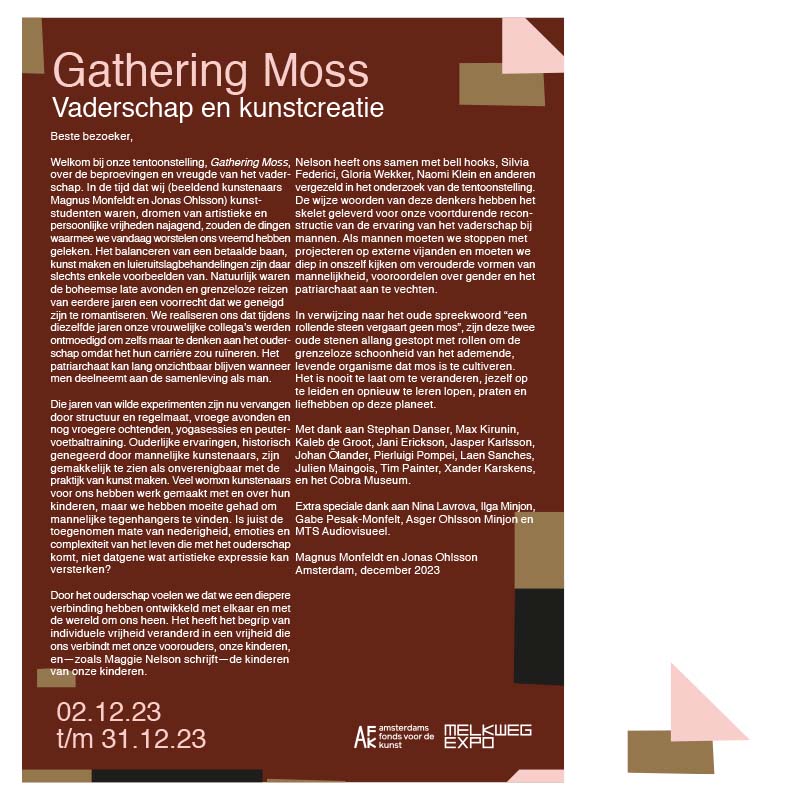
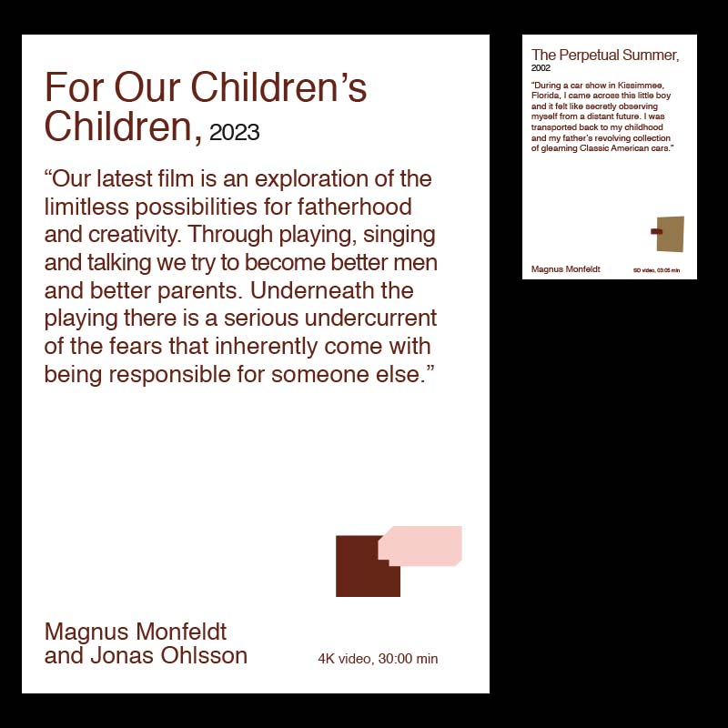
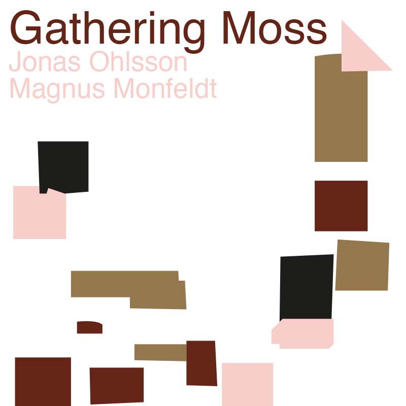
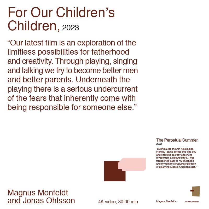
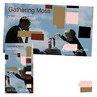
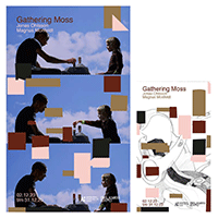
Gathering Moss
VISUAL IDENTITY
Gathering Moss
Comissioned by
Melkweg Expo
Melkweg Expo
Gathering Moss is a exhibition starten dec2 till dec31 all about the trials en jubilations of fatherhood. The graphic design for this exhbiition jumps between a child like playfullnes and a serious note on what masculine aspects should supposed to be. Playfull compositions with stereotypical earthy/masculine colourtones.
008
GRAPHIC DESIGN
TYPOGRAPHY
ILLUSTRATION
VISUAL IDENTITY
TYPOGRAPHY
ILLUSTRATION
VISUAL IDENTITY
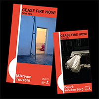
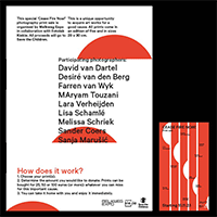
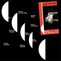
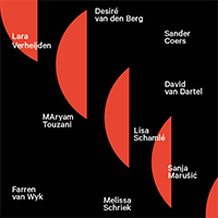
IMAGE 1-5:
VISUAL IDENTITY
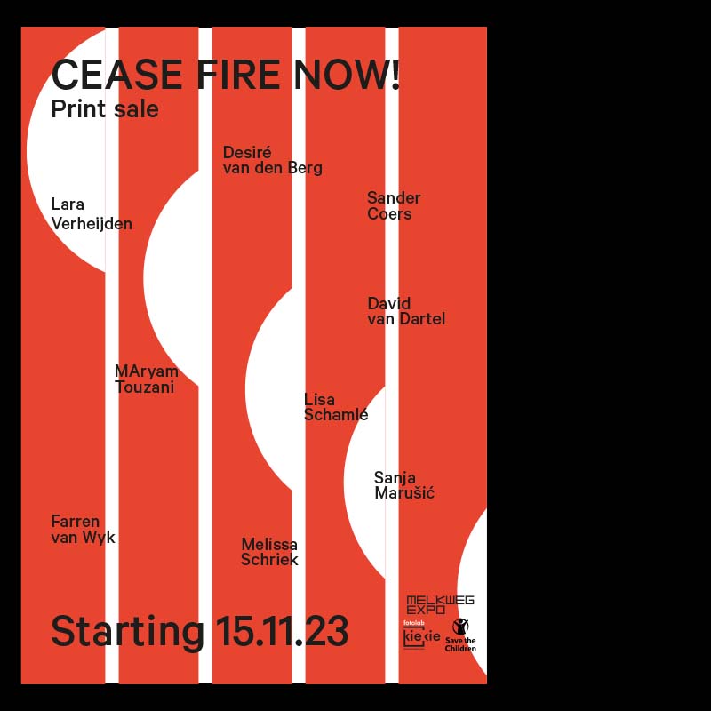
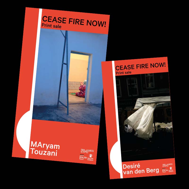
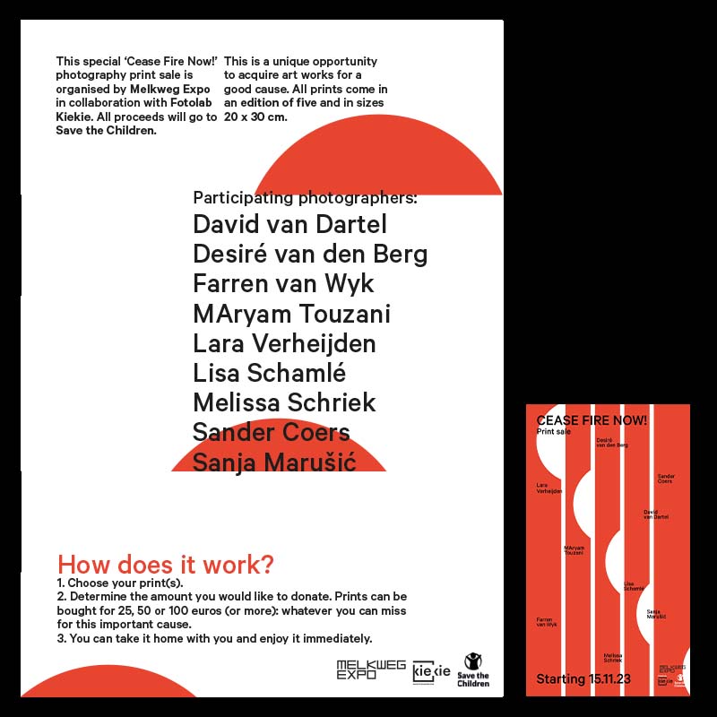
Cease Fire Now!
VISUAL IDENTITY
Cease Fire Now!
Comissioned by
Melkweg Expo
Melkweg Expo
The Cease Fire Now! campaign in light of a print sale organised by Melkweg Expo in order to raise money for Save the Children. Campaign started because off recent war activities in Gaza. General argument of this campaign was to seize weapons in this area.

009
GRAPHIC DESIGN
TYPOGRAPHY
ILLUSTRATION
VISUAL IDENTITY
TYPOGRAPHY
ILLUSTRATION
VISUAL IDENTITY
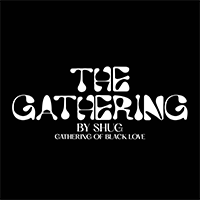
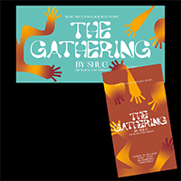
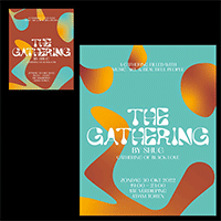
IMAGE 1-5:
VISUAL IDENTITY
THE GATHERING
BY SHUG
VISUAL IDENTITY
THE GATHERING
BY SHUG
Comissioned by Shug
for The Gathering
for The Gathering
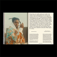
The Gathering by Shug is an intimate and lighthearted event celebrating different kinds of creativity in honor of black love.
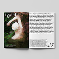
010
EDITORIAL DESIGN
GRAPHIC DESIGN
TYPOGRAPHY
GRAPHIC DESIGN
TYPOGRAPHY
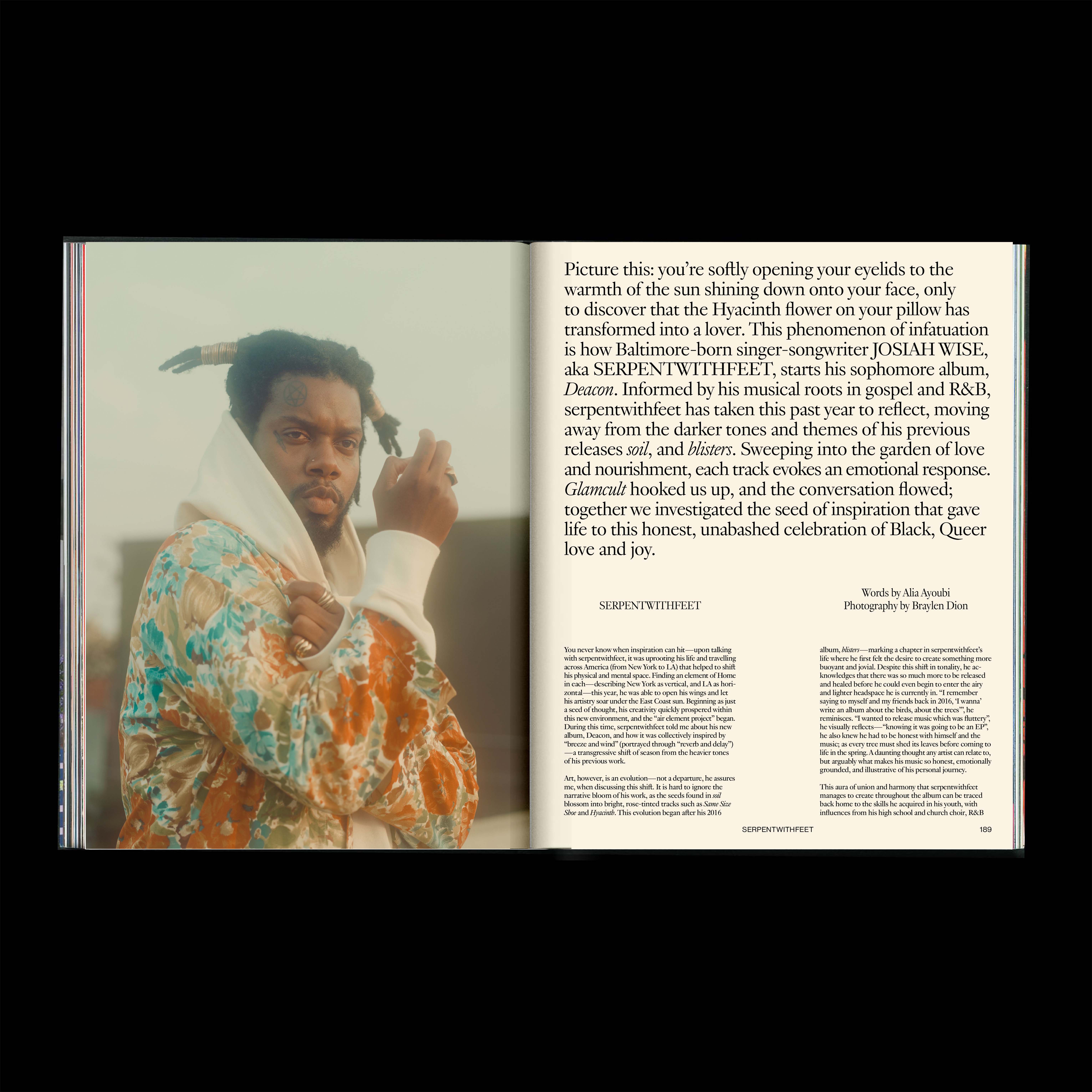
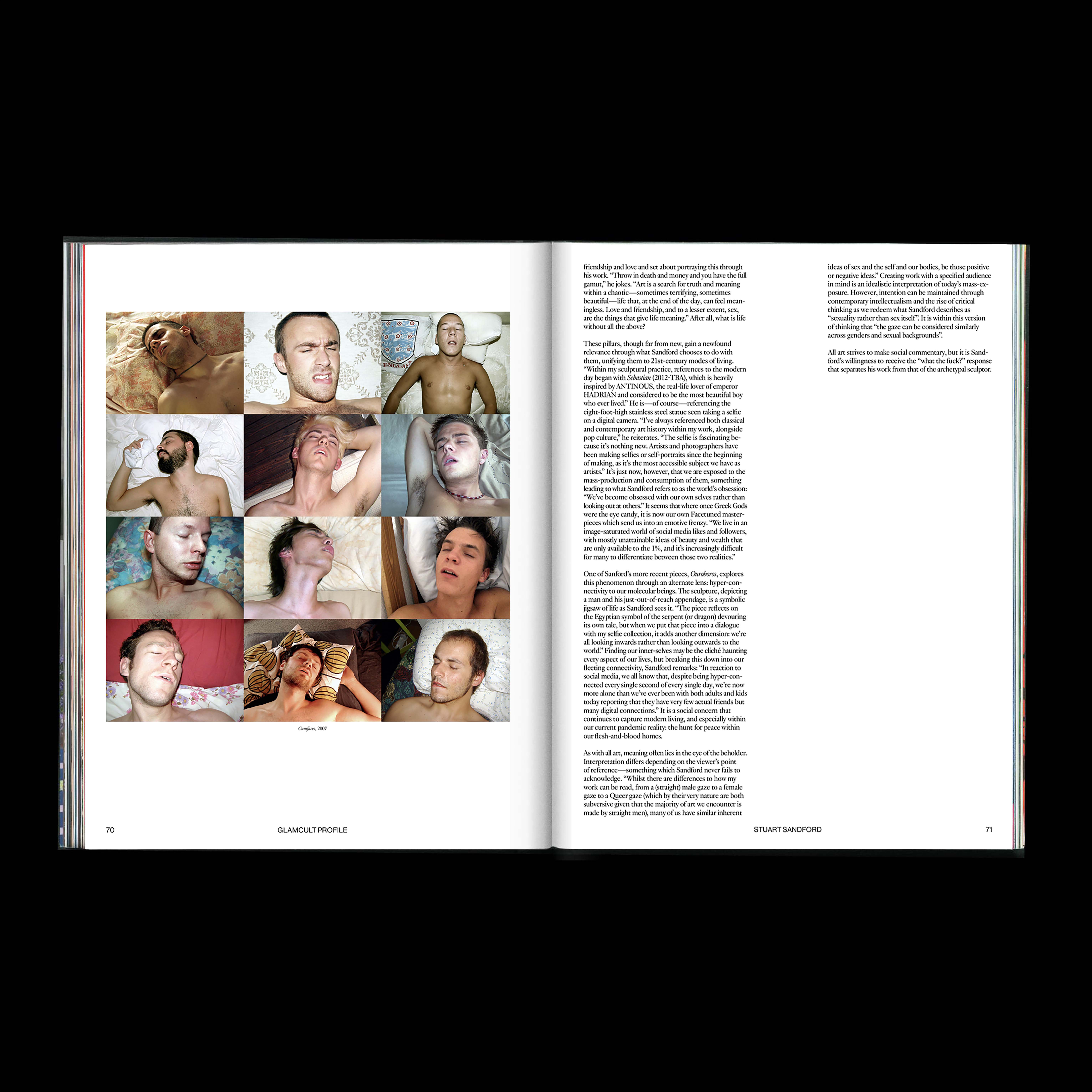
IMAGE 1-6:
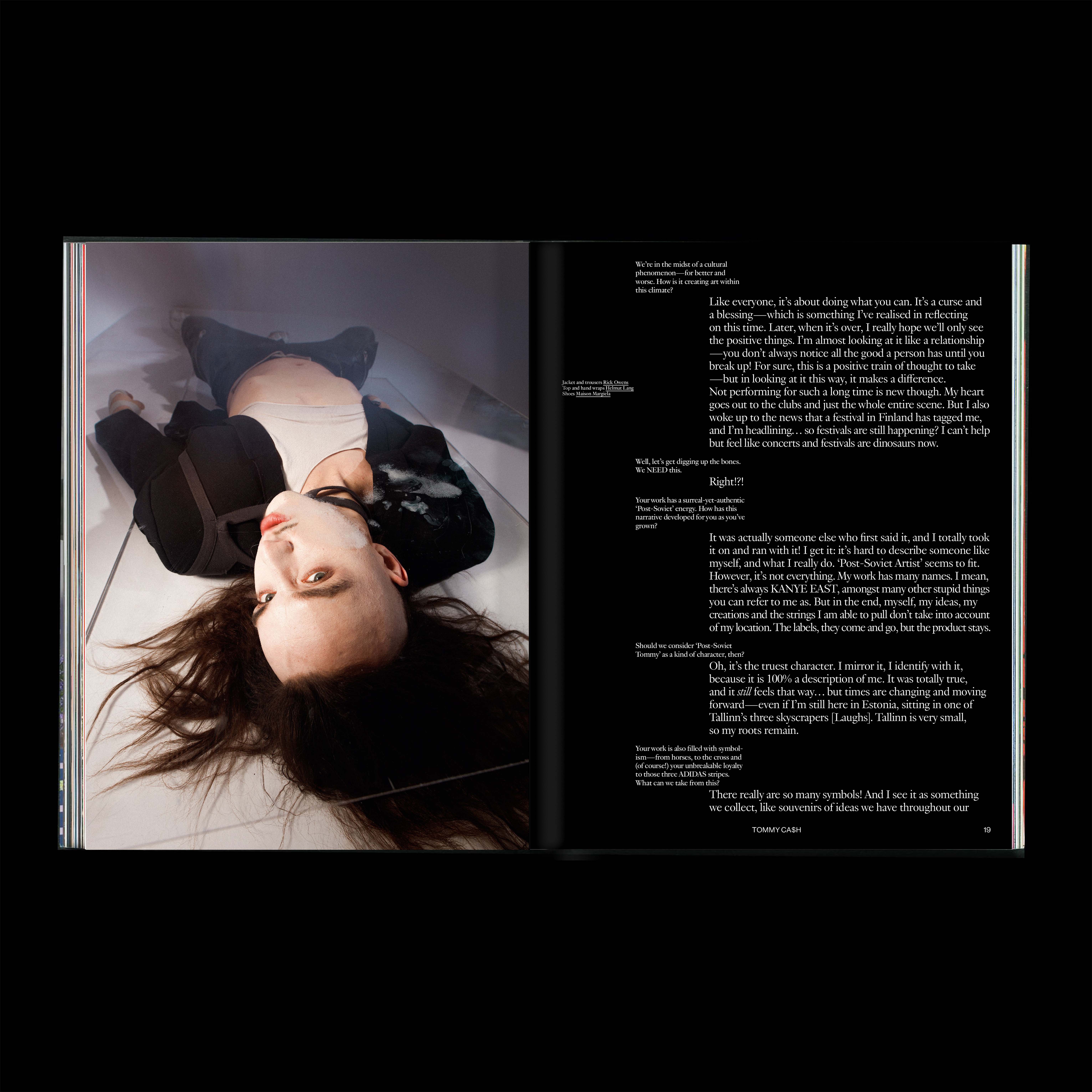
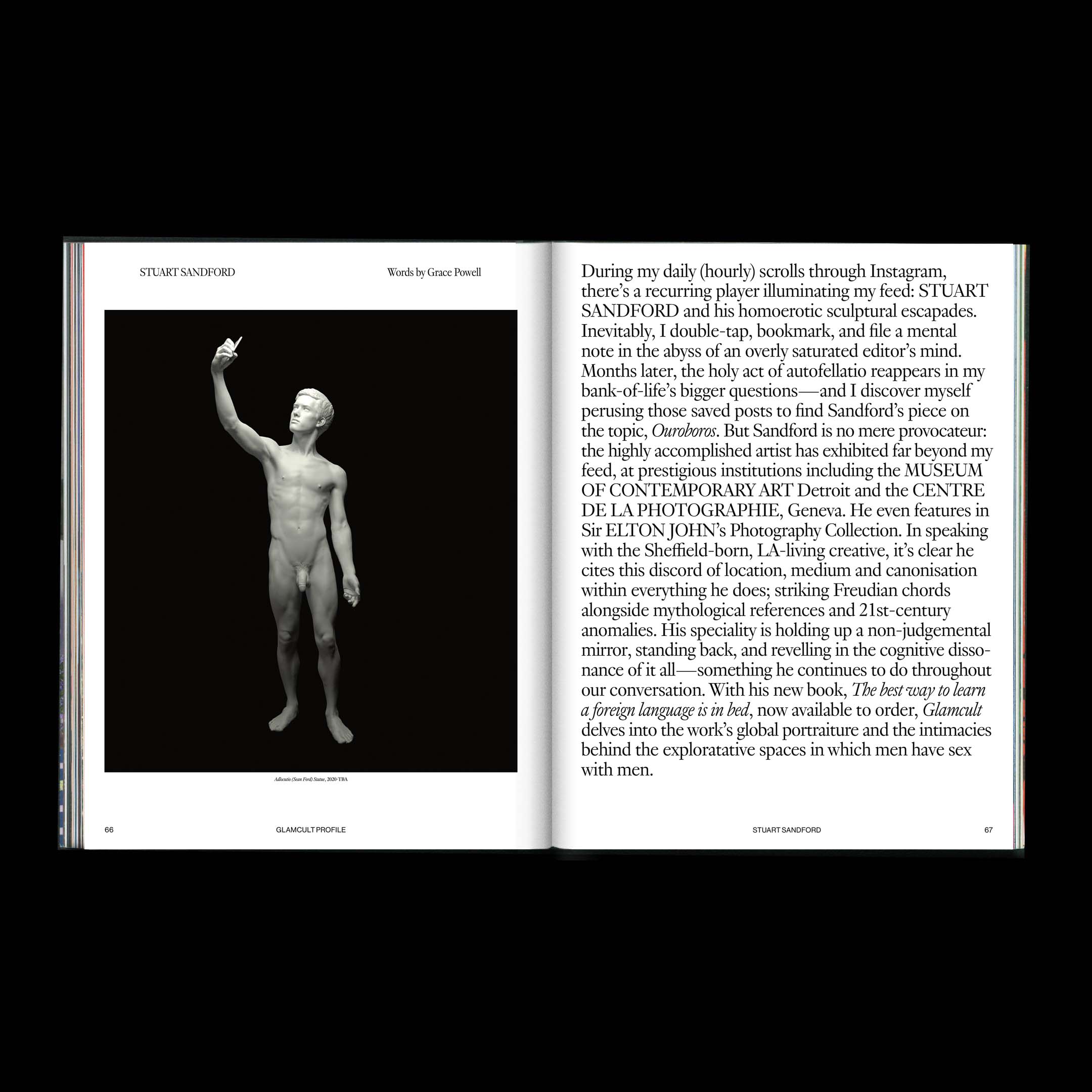
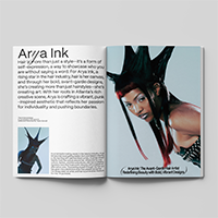
Glamcult Internship
Coming Home Issue
Glamcult Internship
Coming Home Issue
Part of Glamcult
Studios Graphic
Design Internship
Studios Graphic
Design Internship
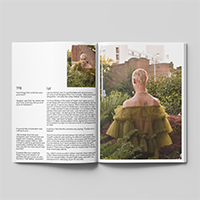
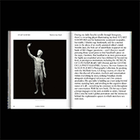
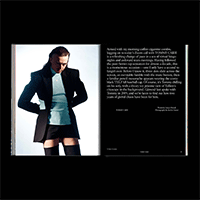
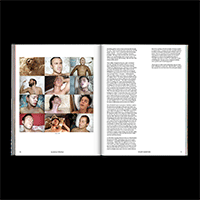
During my internship at Glamcult Studios I got to co-design the most recent Glamcult Issue: #135 Coming Home. A topic close to my heart. Certain keywords used in finishing the design, were freedom, connectivity/being interconnected. Take a look and have a read.

011
FILM
CREATIVE
DIRECTION
CAMERA
EDIT
CREATIVE
DIRECTION
CAMERA
EDIT
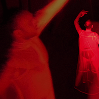
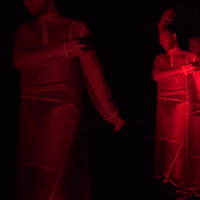
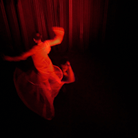
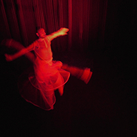
IMAGE 1-5:
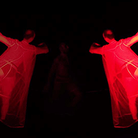
We are the Sublime
We are the Sublime
Commissioned by
Melkweg Expo
Melkweg Expo
We are the Sublime visualizes the journey of finding your inner sublime. In times where communities are hindered to interact. The only way to escape your environment is to flee into the mind. In this videoart piece I visualize this throughout the act of daydreaming.
Watch full film: https://vimeo.com/713472223?share=copy
Watch full film: https://vimeo.com/713472223?share=copy